Here we are in September already!
Things have been getting busier and busier! First of all, we want to thank all of our clients, old and new, for continuing to be part of the Hamil Bros Family of clients! You guys all rock! So let’s jump in!
We recently went through a big expansion of opportunities for our parents’ ministry, Spring Creek Ministries. If you want to learn more about that, check it out here! Ross wrote a good size blog to explain the coming changes, and we’re REALLY excited about them.
Brand Design and Supplement
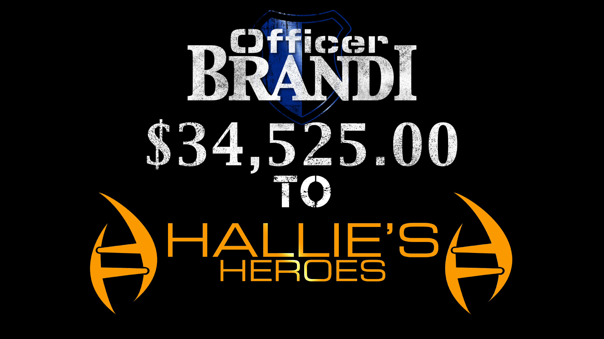
What we’re going to talk about is the Spring Creek Crew Word Mark design. I’ve been recently diving into brand design and logo implementation over the last year and a half. Doing Logo/brand designs/supplements for several different projects like our good friend Officer Brandi, Hallie’s Heroes, The Dream Sports Performance, and some others that I can’t begin to think about right now. I REALLY enjoy doing it. So when we decide to expand Spring Creek Ministries to encompass a more active volunteer base, I knew I had to implement a brand friendly identity for that group of amazing people.

Be Brand Appropriate
I had fun with the whole design process because it’s not just about “How cool can I make it look?” It’s got to be appropriate to the overall brand. This may sound super elementary to some of the designers we know, but you others will benefit from it! We’ve grown up in West Texas, which if you’ve lived here, you understand that it has never been the forefront of marketing and advertising. If you live here, you’ll understand this and if you don’t, you probably have some example in your market you can relate this to.
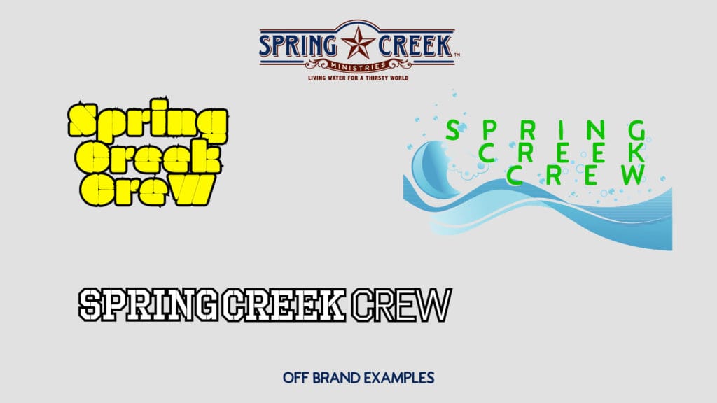
Off Brand Examples
We see a LOT of companies (and this plagues small businesses the worst usually) that when they add a new division to their company or add a new service, they find someone who doesn’t know anything about their brand or services, maybe a freelance graphic designer, or even worse, someone on fiverr, to design the logo, icon, word mark, for this new division. The biggest pitfall I see with those sorts of things is that the new division, doesn’t look like it’s tied to the original company at all. The division should incorporate elements of the overall brand into it’s visual presence somehow. So I made a breif explanation of what I’m talking about.
I’m going to start by showing you how this can go wrong. If you looked at any of these word marks, you wouldn’t know to associate them with Spring Creek, except for the name right? And even then, you’d probably be racking your brain on why “Spring Creek” sounded familiar, but wouldn’t be able to place it.
So now let’s look at what we did for the actual design, what you partially saw in the featured image of this blog.
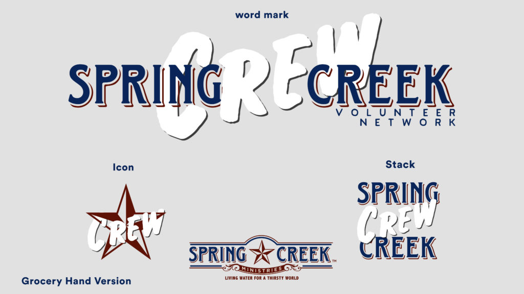
You can see how we pulled from the brand for the most part. Using the “Spring Creek” out of the original word mark, and then implementing the star in the icon. Now, we added a new font that wasn’t part of the brand before. We wanted the crew to feel like it was inviting and a breath of fresh air. We feel like the new addition is VERY appropriate to the overall Spring Creek Ministries Brand.
So there is your little tidbit of branding information for today. Hope you enjoyed it! Please leave us a comment and we’d love to hear your thoughts!
Recent Comments