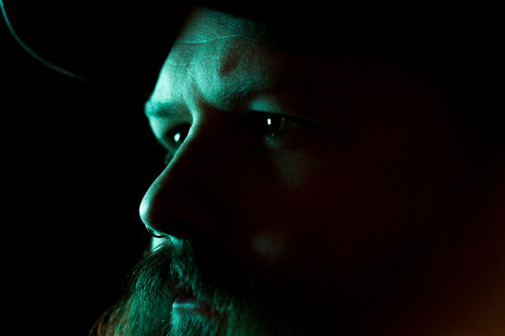
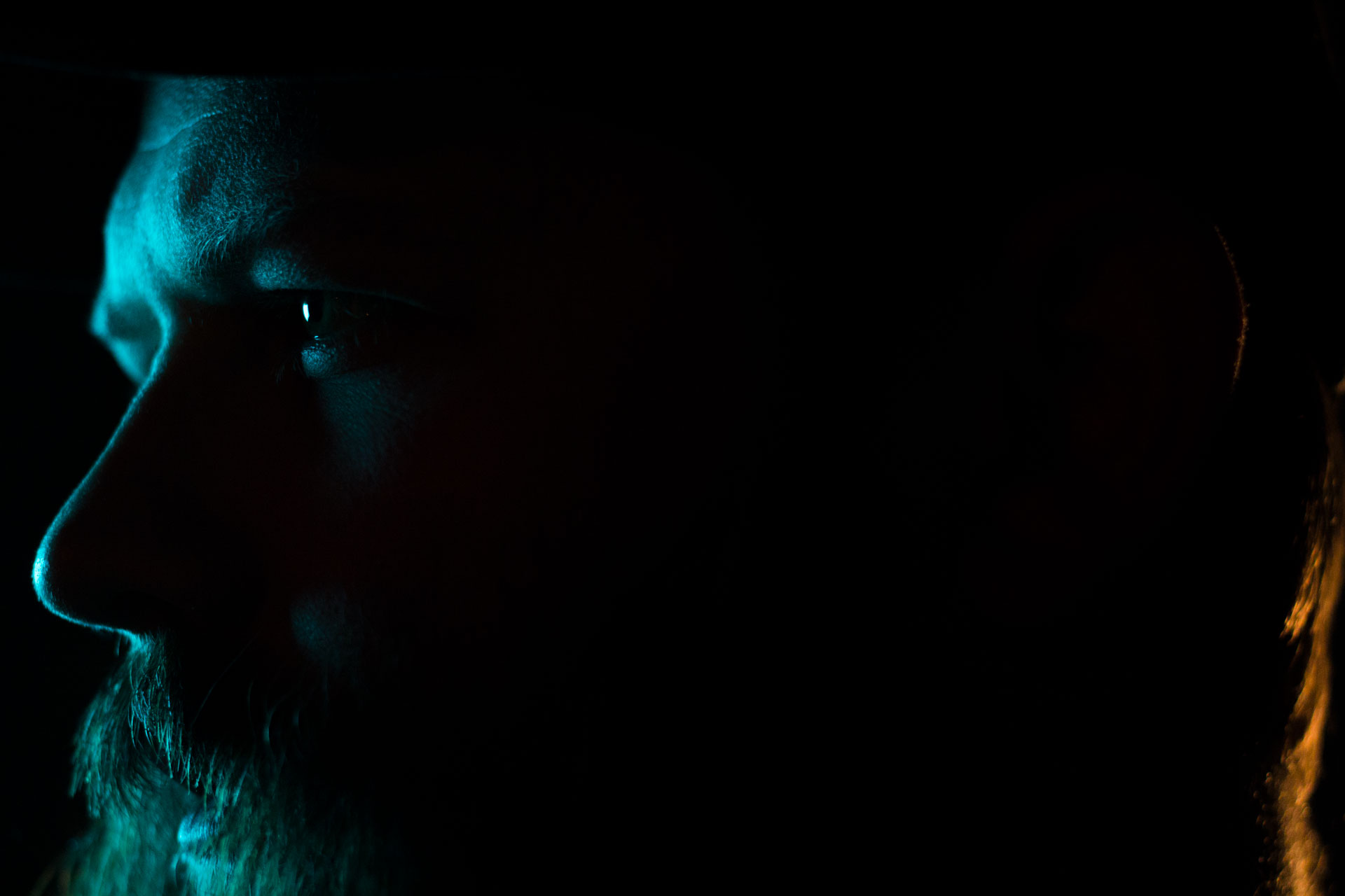
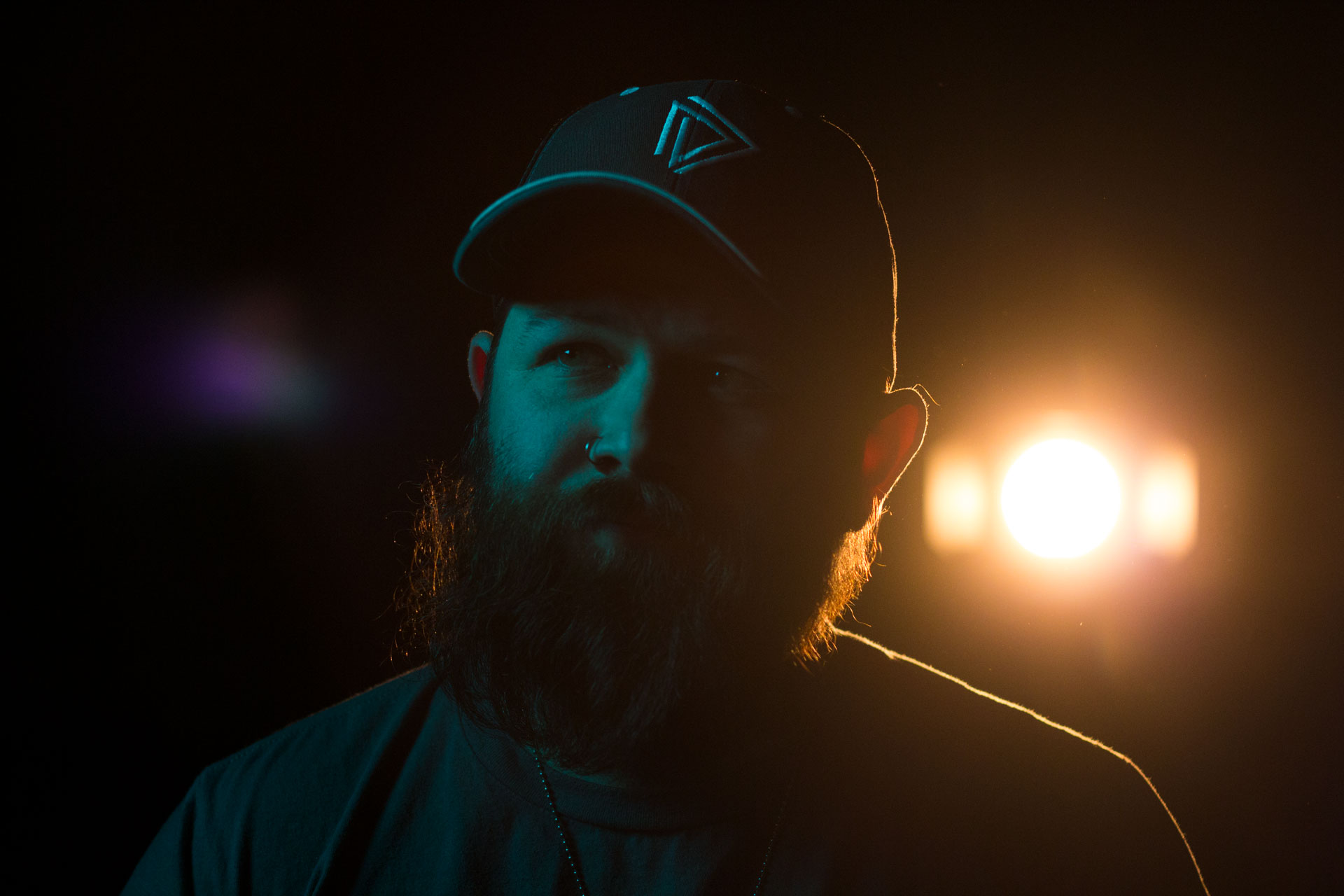
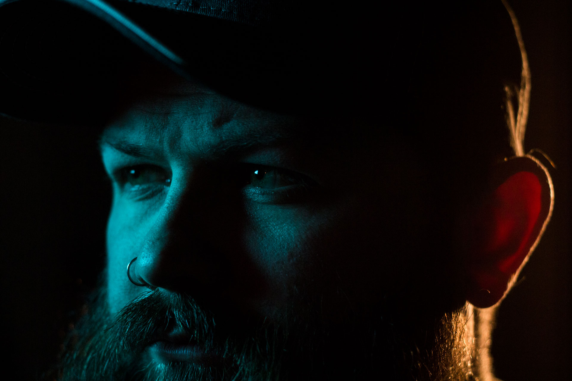
You may have been following our instagram last week to and seen some photos from a lighting test we did with an Arri Skypanel s60. Man that light is a BEAST. Anyways, we created a little “photobox” with the skypanel and took some cool photos. This was really a stretch in learning and trying something new. In production, I’m always terrified of oversaturated and undersaturated in terms of color output and final delivery. I learned saturation at a very young age. Our grandparents in Lubbock had a small color TV they kept in one of the back bedrooms. It was a dial TV. It had a channel dial, a power dial, and a saturation dial. I learned, as a kid, what that saturation dial can do. It gives color! I also learned there can be too much of a good thing. If you push that saturation dial all the way up, the colors start to bleed and people start looking like Oompa-Loompas. So this particular test was a step into unfamiliar territory.
Lighting Breakdown
We constructed a “photobox” as I like to call it. Normally, I would have chosen to do it differently, but I just wanted to make it happen so here’s the setup. The skypanel was in party gel mode and I had it pushed to this turquoise hue and about 50% saturated. I took a C stand and set it opposite of the skypanel. I draped a black moving blanket off the boom arm to create our negative fill. Then, I draped a dark red blanket between the skypanel and the C stand to put a topper on the light. I was basically trying to cut as much light spill as possible. I put an Arri 300 plus fresnel as a fill light shooting straight on to Ross. It was dimmed as far as it would go without being completely off. The backlight is a 650w fresnel dimmed to about 25% which gave me this really lovely warm tone. Exactly what I was looking for.
The Camera
The camera was a canon t3i with the nifty 50mm lens at an F2.8. This lens is incredibly sharp for its build quality and price. Pretty simple. The camera color temperature was set to 5600K.
The Look/Grade
In the grade, I didn’t have to do much work. I ultimately went with a cooler color temp because I like how it changed the overall grade of the stills. This is what the testing is all about! Figuring out what you like and what you don’t. During the grade, I pushed the color temp down to 4000K because I loved how it took the turquoise to a more deep blue as well as took the back light from an orange more to a soft gold.
These are just some of the things we go through when testing for video productions and I thought it would be fun to share!

Recent Comments